

Did you know that 75% of customers recall a business due to its signs? This indicates just how crucial color is in custom neon signs. Color is not just pleasing to view; it is also visible easily, triggers emotions in people, and strengthens brand identification.
Using the correct colors is the key to getting noticed, conveying your message, and keeping you in someone's mind.
Remember these key points when choosing neon sign colors:
-
Visibility: Bright colors get noticed, ensuring people can spot your sign from a distance.
-
Emotion: Various colors bring out various emotions. For example, blue suggests calmness, while red signifies energy.
-
Branding: Your chosen colors should reflect your brand identity and values, enhancing recognition.
This guide will help you choose the best color for your custom neon sign. By exploring aesthetics, messaging, and personal preferences, you will make an informed decision that can attract your target audience.
Why Color Choice Matters for Custom Neon Signs
Colors significantly affect how people remember brands and choose what to buy. Let's look at the numbers:
-
Up to 90% of snap judgments about products are based on color alone.
-
Colors can increase brand recognition by 80%, making selecting the best colors for neon signs essential.
Colors create different feelings and send different messages, affecting how people view your brand. Here's what different colors mean:
-
Red: Captures attention and evokes excitement, often used for promotions or announcements.
-
Blue: Suggests trust and calmness, making it a popular choice for corporate settings.
-
Green: Represents freshness and eco-friendliness, which is excellent for companies concerned about nature.
 Colors affect our emotions and behavior, so choosing the appropriate colors for neon signs is crucial. Various colors convey various messages and help set the mood in your place.
Choose LED neon sign colors that speak to your customers. The right colors can create a strong emotional bond with your audience and shape how they feel about your business, making color selection a key part of your brand identity.
Popular Neon Sign Color Combinations
Picking the perfect neon sign colors can make your sign stand out. Here are a few color combinations that work nicely:
1. Pink and Blue
These colors provide a fun, chic look. Pink brings warmth and a touch of femininity, and blue brings serenity. When combined, both of these colors draw in a large number of people.

2. Purple and Yellow
This vibrant combination depicts creativity and energy. Purple symbolizes luxury and imagination, and yellow brings happiness and positivism. The combination is visible and striking.
 3. Green and White
Excellent for health or eco-friendly companies. Green symbolizes nature and freshness, and white depicts simplicity and honesty. The color combination has a clean, contemporary feel that appeals to eco-friendly shoppers.
 4. Red and Black
The classic combination is often used for its dramatic impact. Red quickly gains attention with its energy, and black brings sophistication. The combination is ideal for areas that require a dramatic presence.
 These LED neon sign color combinations complement well and play a key function in branding and conveying a message. Consider how these combinations portray your brand when developing the appropriate mood and deciding on color.
Matching Neon Sign Colors to Your Brand or Space
Choosing the color of a neon sign is crucial to enhancing your brand or home decor. Here are a few tips:
Tips for Businesses
-
Align with Brand Identity: Pick colors that reflect your brand's values. For instance, green can indicate freshness and energy in a health business.
-
Consider Emotional Impact: Choose colors that relate to the emotions you want to generate in your customers. Red-orange can create a sense of energy and vitality, whereas light blue can provide a sense of calmness and trust.
Tips for Home Decor
-
Complement Room Aesthetics: Choose neon sign colors that complement your interior style. For instance, a pink neon sign is lovely in a chic bedroom.
-
Create Focal Points: Use contrasting colors to provide a point of focus to a particular section or aspect of your home. An example is a bright yellow sign on a black background that immediately grabs attention.
These tips enable your neon sign to be noticed and viewed by the desired audience, making it more impactful.
Testing and Visualizing Neon Sign Colors
Picking the right colors for neon signs takes some thought. It's helpful to try out and picture different colors before deciding. Here are some useful ways to help you choose:
 1. Digital Mockups
Utilize graphic design software to create digital mockups of your neon sign. This lets you experiment with different colors on different backgrounds, helping you envision how the sign will look.
2. Color Wheels
The color wheel is a great tool to learn about color combinations. It allows you to determine colors that complement each other and enhances your design to be more attractive, enabling you to pick excellent combinations.
3. Working with Designers
Work with neon sign providers or manufacturers. This helpful process allows you to view various colors in more natural lighting and suggestions to ensure you receive the product you desire in the output.
Consider how light affects your colors—they dramatically differ in sunlight, interior, or other lighting options. Look at the color of where you would place the sign, be it inside, outdoors, or in a unique lighting condition.
These tips guide you in selecting the most appropriate neon sign colors for your brand and aesthetic.
Factors to Consider When Choosing Neon Sign Colors
Choosing the color of your neon sign allows other people to view it more easily and recall it more easily.
1. Purpose of the Sign
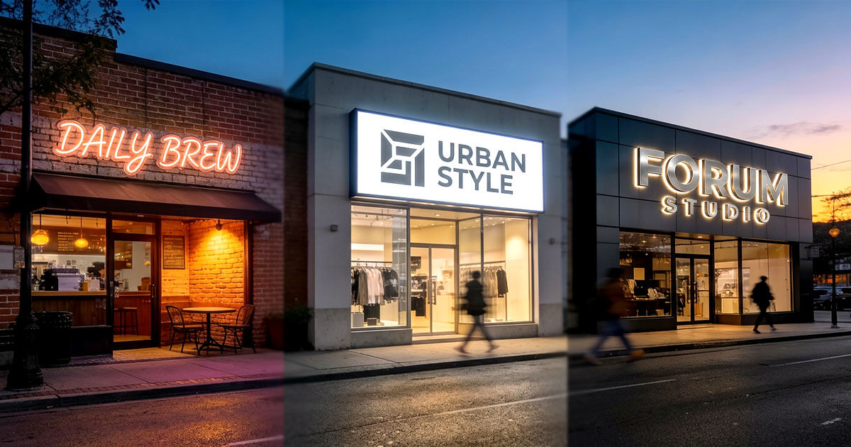
Determine if your sign will be used for business or home decor. Business signs should be in colors you enjoy that also fit your business brand. Bright red can grab attention and show energy, which works well for restaurants. Gentle blues might work better for health and wellness businesses since they help people feel calm and trustworthy.
2. Location and Lighting
Check where you'll put your neon sign. The lighting around it matters greatly because it changes the color's look. A sign in bright light will look different from one in a darker spot. Try your color choices where the signs will go to ensure they stay bright and easy to see.
3. Audience Preferences
Colors also determine how easily you can relate to your customers. Different groups prefer different colors. Younger audiences prefer bright, cool, cheerful pinks, while high-income shoppers prefer dark purples. Using colors your potential customers prefer makes it easy for them to view and know your signs.
Consider these points to guide you in deciding on colors for your neon sign to be readable.
Why Color Contrast Matters in Neon Sign Design
Bright, contrasting colors in a neon sign stand out. If you combine bright colors that work well together, you can be read from a distance, which attracts potential clients to businesses.
 1. Eye-catching effects with Complementary Colors
Neon color pairs that work well capture people's attention. For example, a vibrant orange paired with dark blue is catchy and fascinating.
2. Making Feelings Come Alive with Color Combinations
Combining colors allows you to convey your brand message. For example, bright yellow on a dark background produces a cheerful and vibrant feeling ideal for fun places or celebrations.
As you design your neon sign, use contrasting or opposite colors to make it easy for people to view. Different colors make your sign easier to read and look better, helping it grab attention wherever you put it.
Picking the right colors allows you to create a sign that catches people's attention and matches your brand's look and feel.
Trending vs. Timeless Neon Sign Colors
Choosing the color of your neon sign requires that you know what is trending and has timeless appeal.
 What's Trendy in Neon Sign Colors Today
Today's most popular neon sign colors capture contemporary tastes. Currently, many prefer:
-
Softer pastel shades that provide a cozy and inviting ambiance.
-
Bright primary colors stand out greatly and give places a vibrant feel.
Such colors appeal to younger generations who prefer new, modern, innovative designs.
Timeless Neon Sign Colors
Blue and red, timeless colors used in neon signs, have remained popular. They are attractive because you can use them in various ways; they remind you of better times and also seem bold. These hues are effective for branding across multiple industries, making them reliable choices for long-term use.
 The best neon sign colors blend current trends with classic choices. This mix lets you show your style while staying fashionable for years.
Combining popular colors with traditional ones can make a sign that grabs attention and stays fresh-looking.
Common Mistakes to Avoid When Choosing Neon Sign Colors
Choosing colors for a neon sign can be fun, but it's easy to get it wrong. Here are a few things to remember:
 1. Overcomplicating the Design
Using too many colors can result in a cluttered design that distracts from your message. It is generally better to be simple. Stick to two or three compatible colors for a balanced design.
2. Ignoring the Impact of Lighting
Different types of light impact the way that we view colors. The color you prefer in natural light may be a different shade in artificial light. Experiment using your favorite colors in various lights to determine how vibrant they are.
3. Choosing Trendy Colors
Choose colors that will stay fresh and relevant instead of following the latest trends. Styles come in and out of favor, and trend colors can age a sign quickly. Stick to classic colors that work for your brand and message.
Avoid these mistakes to produce a nice neon sign that symbolizes your brand and looks great for many years.
Final Thoughts on Choosing The Best Colors For Your Custom Neon Sign
Choosing the best neon sign colors will make your sign stand out and catch people's attention. Here are the recaps from this article:
 1. Strategic Color Selection
Colors portray what your brand is all about and stand out. Colors bring out emotions, so choose the ones you wish to portray.
2. Experiment with Combinations
Create various color combinations for your neon sign to produce something unique. Combine bright colors with soft colors to make a dramatic look that is noticed regardless of wherever you place it.
3. Mixing Bold and Subtle Colors
Combine bold, bright colors with soft shades. This combination helps your neon sign stand out while still looking good.
The right mix of colors makes your sign stand out and shows what your brand is all about. Whether you're creating a sign for your business or home, try different color combinations until you find the perfect match that connects with viewers and makes your space look better.


Share: