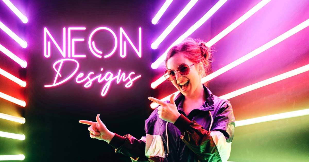
 Neon signs do more than send a message they help build a brand. Business owners utilize bright signs to introduce who they are, draw visitors, and create a welcoming environment.
Remember that colors in a neon sign can affect the feelings of someone who sees it. Different colors create different emotional reactions that can change how customers think and act:
-
Warm colors make people feel energetic and excited.
-
Cool colors promote calmness and sophistication.
-
Neutral tones enhance elegance and modernity.
The strategic use of color greatly enhances the effectiveness of neon signs. By aligning colors with brand messages, businesses can foster stronger connections with their audience.
Using these ideas helps create eye-catching neon signs in multiple colors that connect with people who see them.
The Power of Color in Neon Sign Design
Colors can affect how we perceive and feel, particularly neon signs. Being aware of colors that signify certain feelings can make your sign effective for your business.
What is Color Psychology, and Why is it Important?
Color psychology impacts human behavior and feelings. Neon signs have meaning, and knowing them can be very helpful.
Businesses use them to develop catchy designs to attract buyers.
How Colors Impact Emotions
Different colors create specific feelings, and this is especially true with neon signs:
-
Red: Usually associated with passion and excitement, red attracts and energizes.
-
Yellow: Bright and vibrant, yellow is a joyous hue that can make any room brighter.
-
Green: A soothing color that signifies peace and wellness, and therefore, it is in demand for wellness-related businesses.
-
Blue: Signifies trust and security, and its soothing impact is ideal for working environments.
-
Purple: This signifies wealth and high class; therefore, it is ideal for high-class businesses.
 Mood plays an important role in buyers' perceptions of goods and services. Consumers will purchase items based on their feelings about vibrant and colorful neon signs.
How Colors Affect Consumer Behavior
Colors affect how people feel, influencing what they buy and making choices. A good neon sign with the right colors can:
- Attract attention quickly in a crowded marketplace.
- Create a strong brand identity with coordinated colors.
- Influence moods and make your business significant in your customers' lives.
Although similar designs and colors can change in custom-made neon signs, such as LED changing-color signs, colors have a significant impact.
Correct colors for your neon sign simplify recognition and tie your brand with the feelings your buyers will have.
This strategic approach builds stronger customer relationships, leading to more interaction and better sales.
Understanding the Warm Colors in Neon Signs
Warm colors such as yellow, orange, and red trigger strong emotions and a lot of energy. They can also make an environment friendly, inviting people to enjoy themselves and have conversations with one another.
Knowing how warm colors work in terms of perception for effective neon sign design is important.
The Impact of Warm Colors
Here is how each warm color works in terms of perception:
-
Red is a color that demands attention. It is most often associated with feelings of passion and love and carries a lot of energy. Restaurant neon lights make one crave food.
-
Orange inspires creativity and excitement, so it is effective in theaters and concert venues. An energetic orange sign can draw in people with a warm and inviting atmosphere.
-
Yellow radiates happiness and joy, so it is effective in attracting joy-seeking customers. Candy stores mostly use yellow neon lights to make the environment happy and warm.
 Real-World Examples
Many popular establishments use warm colors in their neon signs:
-
In-N-Out Burger: Bright, bold colors in a sign make them stand out and reveal a friendly personality for the store.
-
The Viper Room in Los Angeles: Orange lights in a nightlife establishment make a party atmosphere and draw party enthusiasts.
The Significance of Warm Colors in Design
Bright, warm colors make a sign stand out and reveal your store's personality. When selecting colors for your custom neon sign, remember that colors can make a difference in people's moods, and that helps them remember your store.
Creating Calmness and Sophistication: Cool Colors in Neon Signs
Cool colors such as blue, green, and purple contribute to a peaceful environment ideal for most companies. Individuals choose such colors for wellness centers, spas, and technology companies because they provide a calm and sophisticated atmosphere.
Benefits of Cool Colors
1. Blue
Known for its calming effects, neon signage uses blue to create a serene atmosphere. Businesses focused on relaxation or professionalism benefit from this color. For instance, many medical offices utilize blue neon signs to instill trust and reassurance.
2. Green
Green is a common and peaceful hue that represents peace and wellness. Therefore, it is perfect for wellness and environmentally friendly companies. Bright green signage attracts and communicates peace and a healthy atmosphere.
3. Purple
Purple signifies new and luxurious ideas, bringing a touch of class to beauty salons and studios with high-class clientele.
 Examples in Action
Consider the use of cool colors by successful businesses:
-
Spas use soft blue signage, producing a welcoming and peaceful environment for visitors to unwind.
-
Tech companies can utilize sophisticated green and purple signage to convey innovation, security, and stability.
Cool colors in your signage make them stand out and allow feelings to become part of your company identity through effective neon sign Color Psychology.
Neutral Color Combinations in Neon Sign Design
Neutral colors, particularly black and white, are crucial when creating neon signs. Black and white form a strong background that enables companies to produce pleasing signs that are neither dominant nor overwhelming.
The Importance of Dark and Light
-
Dark-colored neon signs are regarded as cool and sophisticated and can convey luxuries. Dark color looks best in contrast with lighter colors; therefore, high-class companies utilize them perfectly.
-
Light/White: Pure and simple, white neon signs convey purity and innocence. They make messages readable and viewable in daylight, making white neon signs readable and comprehendible at a distance.
Making Visual Balance
To produce an excellent neon sign, balanced colors must be considered. Following are a few tips to consider:
1. Complementary Color Schemes: dark colors and white can go with powerful colors like blue and red. It will appear balanced and readable.
-
For example, a white sign with a black background is simple and readable.
2. Analogous Color Schemes: Apply a background of a neutral color and colors adjacent to one another in a color wheel. For instance, combining black with dark blue and emerald can form a simple yet sophisticated outlook.
 Such pairs help companies maintain a powerful brand name and make their neon signs effective and memorable.
The perfect combination of a neutral background and bold colors can create a friendly atmosphere for visitors and positively impact them.
Practical Considerations for Maximizing Visibility and Readability with Neon Signs
When creating a neon sign, being noticed is a big part of the process. How well it can be seen can make a big impact, and one simple tip for enhancing it is to use colors that contrast with your background.
Here are key considerations to keep in mind:
1. Color Contrast
Use colors for your sign that will stand out with your background. Yellow and pink will stand out with dark colors, and blue and green will stand out with lighter colors.
2. Lighting Conditions
Know about lights and how they affect your sign's visibility. What will work in daylight won't work at night, and your colors won't glow in sunlight. Use colors that will glow in changing lighting environments.
3. Font Style and Size
Use fonts that can be read a distance away. Font types with bold fonts work particularly well with neon lights, and your message will stand out and be easily read.
4. Placement
Where your sign will go is significant in terms of visibility. Position it in an unobstructed view with nothing in its path. Putting your sign high and at an angle will make it stand out even more.
With these tips your neon signs will be seen and convey your message effectively.
Read Also: Best LED Neon Sign Placements: Where to Hang Them For Maximum Visibility
Customization Possibilities: From Color-Changing Effects to Unique Designs
Color-changing neon lights produce a cool atmosphere and present vibrant and energetic visuals. With an effortless switch, one can change colors according to one's personality or occasion, enhancing any room in any way one wants.
Imagine a vibrant restaurant shifts its cozy, warm, and orange lights at peak dinner times to soothing blue lights for a peaceful evening. With this feature, your visitors will pay attention and have a lasting impression.
Benefits of Customization:
-
Multicolor Options: Various colors can produce vibrant displays with a powerful impact and modify specific moods. For example, a personalized LED neon sign in bold pink and green can introduce a lively and energetic atmosphere.
-
Bespoke Designs: Individualistic designs enable companies to present their unique personality. With a vibrant combination of colors, your sign will become unforgettable.
 Such personalized touches enhance the effectiveness with which neon signs represent the concepts of Neon Sign Color Psychology. By utilizing changing colors and individualistic designs, companies can produce striking environments that resonate with target groups.
Industry-Specific Insights: Best Colors for Neon Signs Based on Business Type
Choosing the proper colors for a neon sign is key to accomplishing a business objective. Every business has colors that resonate with its target, and utilizing them helps make a sign readable and visible.
 1. Restaurants
Red and orange colors work best for restaurants. Red and orange stimulate one to eat and promote a friendly environment. For instance, most restaurants use vibrant red to promote vigor and stimulate consumption.
2. Retail Stores
Green and pink colors grab your attention and convey freshness and vibrancy. Green appeals to youth; therefore, it works perfectly for environmentally friendly companies, conveying youthfulness and healthiness.
3. Health and Wellness Businesses
Blue and purple colors work best for such companies. Blue creates a relaxed atmosphere, lessening tension and inviting relaxation. Purple conveys refinement, allowing such companies to gain trust for their wellness goods and services.
Incorporating these best colors for a neon sign that resonates with an industry maximizes its efficiency and leverages colors' mental impact. Proper colors enable companies to convey value and resonate with one's emotions.
Knowing this information can help you create a neon sign that matches your business goals and catches people's attention.
Case Studies on Effective Color Sign Design Strategies
Looking at successful signs reveals that companies utilize colors to draw in and involve customers.
1. Coca-Cola
The vibrant red neon lights grab your attention and make you energetic and stimulated. The brand's bright colors reveal its personality, creating a welcoming environment for humans to socialize and chat with family and friends.
2. The Green Door
The health-focused establishment employs green neon lights to convey freshness and wellness. Green complements its wellness theme and induces a peaceful and relaxed atmosphere.
3. Las Vegas Strip
The numerous colors present a perfect demonstration of vibrant neon lights. Bright colors such as blue, yellow, and pink trigger happiness, vibrancy, and a desire to go out and have an adventure. Bright colors present a welcoming environment for visitors and locals alike, inviting them to go out and discover new experiences.
The examples illustrate that neon colors can significantly impact how a brand is perceived and behaves. Wise use of colors attracts and enhances both looks and feelings.
Final Thoughts on Effective Neon Sign Colors
Knowing what colors mean can impact your target consumer's perception of your brand. Choosing colors wisely can trigger moods and build positive relationships with your target consumers.
 Applying neon colors effectively can have a lasting impression. Certain key factors to consider include:
-
Choose colors that resonate with your target consumers and your brand.
-
Use warm colors to produce energy and intrigue or cool colors to promote calm and sophistication.
-
Experiment with customization, make your signs stand out, and tailor them according to your preference with additional options.
Use these tips to produce vibrant, eye-catching neon lights that draw visitors and convey feelings and colors. Your competition will find it difficult to compete for your business when your signs stand out and describe feelings and colors.


Share: