
Every other decision on a neon sign is reversible. Color changes on the spot with an RGB neon sign and remote, brightness dials down when a room needs calm, and a sign that looks wrong above the sofa moves to a studio wall with two new holes.
The acrylic panel underneath is the exception. It gets cut once, in one shape, one color, one thickness, and it stays that way for as long as the sign exists.
Which makes it odd that the backing is the decision buyers spend the least time on. The font takes an hour. The panel gets four seconds and whichever option is pre-selected and free.
The consequences show up later. A clear panel that vanished in the product photo picks up your wallpaper pattern and blurs the letters. A contour cut that looked elegant on screen arrives with thin acrylic bridges holding the words together. A plain rectangle turns out to be the reason a storefront sign survived two refits.
Sign shops show these options as thumbnails with a price difference attached and almost no explanation of which suits which design. This guide covers what the thumbnails leave out: how the three main panel shapes behave once they leave the workshop, how thick yours needs to be at the size you want, what backing color does to contrast in a real room, and which choices keep installation simple. If you are still planning your custom neon signs, read it before the design gets finalized.
What Is an Acrylic Backboard on a Neon Sign
An acrylic backboard is the clear or colored panel that holds your LED neon flex in position. It locks the tubing into the shape of your design and gives the sign a rigid surface to mount from.

Acrylic gets the job because of what it is. The material (technically PMMA, sold under names like Plexiglas and Perspex) weighs roughly half what glass weighs, takes far more impact before it fails, and breaks into blunt pieces instead of shards if it ever does. It also cuts cleanly on a laser to any outline you can draw. Glass would be heavier and far more dangerous in transit. Wood blocks light and moves with humidity. Metal fights the whole aesthetic.
Take the panel away and a neon sign is a rope of silicone with strong opinions about gravity.
Wiring is the part buyers rarely think about. Small holes are drilled through the panel so connector wires can pass behind the board and run to a single exit point, which is how a well-made sign ends up showing tidy light and almost no cable on the front face. Cheaper signs skip that step and run the wires across the surface instead. You notice immediately. So does every photo taken in that room.
Backing Shapes Compared, Rectangle, Cut to Shape, and Cut to Letter
Three shapes cover most custom orders, and each one solves a different problem.
| Backing shape | Best suited to | How it reads in a room | Trade-off to accept |
|---|---|---|---|
| Circle, rectangle or square | Block fonts, logos with mixed elements, signs that travel | Framed and gallery-like | Larger footprint, visible panel edge |
| Cut to shape (contour) | Script and cursive fonts, single phrases | Floating letters with a slim halo | Less protection for the tubing, wiring between words is easier to spot |
| Cut to letter | Signs going on patterned or richly colored walls | Close to invisible, letters only | Most fragile, multi-line text often needs separate panels and cords |
A rectangle is the most forgiving option by a wide margin. The panel supports every part of the design, the edges are straight, and the sign survives being packed, unpacked, and rehung repeatedly. Event planners and anyone renting out signage lean on rectangles for exactly that reason.

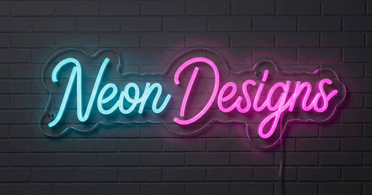
Cut to shape traces the outline of your artwork with a narrow border. Script fonts look their best on it because the letters appear to hover. The catch is structural: a contour cut leaves thin acrylic bridges between design elements, and those bridges are the first thing to crack if the sign gets handled roughly.
Cut to letter goes further again, trimming the panel right to the edge of each letterform. On a boldly painted wall or patterned wallpaper the effect earns its extra cost, because nothing interrupts the surface behind the light. Ask about multi-line text before you commit, though. Custom neon makers commonly split cut-to-letter signs with two or more lines across separate panels, each with its own power cord, which turns one hanging job into an alignment exercise.
Let your font choose the shape. Script wants contour, block wants rectangle, and a busy wall wants cut to letter.
How Backing Color and Finish Change the Look of Your Sign
Clear acrylic is the default for good reason. It reads as neutral in most rooms and lets the wall color show through, so the sign integrates instead of announcing itself.

It is also the wrong choice more often than people expect. Against wallpaper with a strong repeating pattern, a clear panel picks up the print behind it and muddies the outline of the letters.
Glossy black is the highest contrast option on the menu. Pale neon colors like white, warm white, and ice blue gain real punch against it, which explains its popularity in bars and gyms. Fair warning: glossy black shows dust and fingerprints the way a piano lid does, and the panel stays visible as a solid rectangle even when the sign is switched off.

White sits in the middle. The surface bounces light back at the viewer instead of absorbing it, softening the glow in a way that suits bedrooms and nurseries.
Mirrored gold and silver finishes add depth and bounce, and they photograph beautifully in controlled lighting. Under a direct camera flash they can throw glare straight back at the lens. For a mirror effect you can actually control, infinity mirror neon signs are built for exactly that and handle it better.

Printed panels are the option most buyers. With UV printed neon signs, artwork, color blocks, or a full logo lockup get printed directly onto the acrylic and the neon flex sits on top. For brands whose logo includes a shape that cannot be formed in tubing, this is usually the answer.
How Thick Should a Neon Sign Backboard Be
Around 5mm (roughly 3/16 of an inch) is the thickness most custom neon workshops publish as standard, with panels typically available somewhere between 3mm and 8mm. Most signs never need anything other than the standard.
Thickness matters because acrylic flexes across unsupported spans. A thin panel on a small sign stays flat. Stretch the same thin panel across four feet of wall and it will bow gently in the middle, and once it bows, the mounting points start taking uneven stress.
| Sign width | Practical thickness | Why |
|---|---|---|
| Under 24 inches | 3mm to 5mm | Short spans, minimal flex, keeps weight low |
| 24 to 48 inches | 5mm, stepping up to 6mm on wide single-line designs | Holds flat with normal fixings, though fabricators differ on where the step-up begins |
| Over 48 inches | 6mm to 8mm, or multiple panels | Resists bowing, spreads load across more anchors |
Treat that table as a starting point, not a rule, because published guidance varies between fabricators. Some step up to 6mm well before the four-foot mark. Ask your maker what they cut at your chosen size.
Oversized designs get split across two or more panels instead of being cut from one sheet, partly for rigidity and partly because oversized acrylic is difficult to ship without damage. Two panels arranged together hold their shape better than one enormous sheet, and they cost less to freight.
Thicker is not automatically better. Extra thickness adds weight, and weight means better wall anchors, more fixing points, and a sign that is harder to hold in place while you mark the holes. On a small sign nobody will ever see the difference.
How Your Backing Choice Affects Mounting and Installation
Your backing shape determines your installation method, and you choose it weeks before you ever pick up a drill.

Rectangle panels hang most easily because the corners give you four well-spaced fixing points in solid material. Holes get drilled during production, so the job on your end is mark, drill, plug, screw. Most rectangles also work with a hanging kit if you would sooner suspend the sign than fix it flat.
Contour cut panels are fussier. The border around your design is the only place a hole can safely go, so fixing points land where the outline allows, not where you might prefer. On a wide phrase with a long unsupported stretch in the middle, ask for an extra fixing point rather than trusting two corners.
Cut to letter signs demand the most. Individual elements may each need their own fixing, and a standoff setup (small metal barrels that hold the panel slightly off the wall) is often the cleanest solution because it hides the cable in the shadow gap behind the sign.
Adhesive strips deserve a warning. They are fine for the smallest signs on smooth painted drywall. For anything with real weight, use mechanical fixings suited to your wall type, which means toggle anchors in drywall, masonry plugs in brick, and proper care around tile. Our neon sign installation guide walks through each wall type and the hardware that goes with it.
Outdoor Neon Sign Backing Requirements
Acrylic itself handles outdoor life well and stays stable under UV without yellowing. The vulnerable parts are everywhere the panel has been opened up: drilled holes, cut edges, and the points where wiring passes through. Water finds those first.

An outdoor sign needs a weatherproof rating on the tubing and the wiring, specified at the order stage, not bolted on later. IP65 means dust-tight with protection against water jets from any direction, while IP67 adds temporary immersion, tested to one meter for thirty minutes under IEC 60529. Sheltered awnings and covered patios sit comfortably at the lower rating. Full exposure and anywhere prone to standing water needs the higher one.
The panel plays a supporting role. Thicker acrylic resists wind load, extra fixing points stop the sign flexing in a gust, and rubber gaskets under the screws let the material expand and contract through temperature swings without cracking around the fixings. Acrylic expands and contracts more than glass does as temperatures change, so that small allowance matters more than it sounds.
Over-tightening is the most common outdoor installation error. Acrylic is rigid but notch-sensitive at a drilled hole, and a screw driven hard into a panel that is already trying to expand in summer heat will eventually star-crack around the fixing.

The power supply needs its own plan, either housed in a weatherproof enclosure or positioned inside with only the low-voltage run passing outdoors. Our guide to weatherproof custom LED neon signs covers the full specification, including what changes for coastal and high-humidity locations.
What Backing Options Add to Price, Size, and Lead Time
Rectangle and contour cuts are the two standard options at most custom neon workshops, and they often carry no upcharge at all. Cut to letter panels, fully custom outlines, mirrored finishes, printed artwork, open boxes, and freestanding acrylic stands all involve extra cutting, extra material, or extra assembly, so they cost more. Check the specific pricing wherever you order, since it varies.
The cost people forget is size. The backing adds a border around your design, so the finished panel always runs larger than the text itself. Measure your wall space against the panel dimensions, not the letters, or you will discover the gap above your sofa is an inch too tight after the sign arrives. Any good neon sign design tool shows you the full panel size before you order. Check that number twice.
Lead time tracks how complex the cut is, not the backing type on its own. A custom outline has to be drawn, approved, and cut, which adds a step compared with a standard rectangle. Multi-panel signs may also ship in more than one box, worth knowing if your sign needs to reach a venue on a specific date.
Backing Choices That Work for Weddings, Storefronts, and Home Spaces
Weddings and events. Choose for handling, not just looks. A wedding sign gets transported, propped, hung, taken down, and often loaned out afterward, so a clear rectangle or a contour cut with a generous border survives that cycle far better than a delicate cut to letter piece. Couples browsing wedding neon signs usually want the sign to disappear into the florals, and clear acrylic does that job without the fragility. Our roundup of wedding neon signs for backdrops shows how different panels read on camera.
 Cafes, salons, and storefronts. Contrast wins at a distance. A black or white panel keeps lettering legible from across the street and through glass, where a clear panel competes with whatever sits behind the window. Durability matters here too, since commercial signs get bumped, cleaned, and occasionally moved during a refit. The reasons neon signs help shops and cafes attract more customers come down to being seen and being remembered, and the backing contributes to both.
 Living rooms and bedrooms. This is cut to letter territory. Against feature wallpaper, exposed brick, or a deep painted wall, a near-invisible panel keeps the surface intact. If you are decorating with home decor neon signs, match the panel to the wall treatment, not to the sign itself.
Kids’ rooms. Rectangle, every time. Rounded corners, a solid panel, fixings rated for the wall. Safety beats subtlety when the sign lives at eye level for someone three feet tall, which is the same logic behind our advice on LED neon signs for kids’ rooms.
 Gaming setups and studios. Black panels read cleanly on camera and stop the backing catching key lights. Anyone building a streaming background with gaming neon signs should test the finish under their actual lighting before committing, because glossy surfaces bounce ring lights straight back.
 Backing Myths That Lead to the Wrong Order
"Clear acrylic is invisible." Close, but not identical. Clear panels catch light along the cut edges, cast a faint shadow on the wall behind them, and pick up whatever pattern sits underneath. On flat painted walls the effect is negligible. On textured or patterned surfaces it is obvious.
"Thicker acrylic is always better." Extra thickness helps large signs and does nothing for small ones except add weight and cost. Match thickness to span.
"Cut to letter is the premium choice." It is the most delicate option and the fussiest to install, and on multi-line text it can mean separate panels with separate power cords. Right choice for the right design, wrong choice as a default.
"The backing color does not change the light." A white panel bounces light back toward the viewer while a black one absorbs it, so identical tubing genuinely looks different on different panels. Pale neon colors gain the most from a dark backing.
"Any workshop can cut any shape." What a workshop can cut, and the grade of acrylic it cuts, varies widely between suppliers, and thin acrylic on an oversized sign is one of the cheapest corners to cut. Our guide on how to spot neon sign scams covers the questions worth asking before you pay a deposit.
Your Acrylic Backing Checklist Before You Order
Run through these five points before you confirm your design.
1. Shape matches font. Script goes contour, block goes rectangle, patterned wall goes cut to letter.
2. Color matches the wall, not the sign. Decide what you want the panel to do, disappear or create contrast, then pick from there.
3. Thickness matches span. Standard for anything under four feet, heavier or split panels beyond that.
4. The mounting method is settled. Know your wall type and confirm fixing points before production starts, not after delivery.
5. Indoor or outdoor is specified. Weatherproofing is an order-stage decision, not an afterthought.
The mistake that comes up most often is choosing a contour cut for a design with wide gaps between letters or words. The cut follows the outline faithfully, the gaps become thin acrylic bridges, and a sign that looked elegant in the mockup arrives more fragile than expected. When a design has generous spacing, a rectangle protects it better and usually looks more considered anyway.
Get the panel right and nobody will ever mention it, which is exactly the point. A backing does its best work when the only thing anyone notices is the light. If you want a second opinion on which panel suits your artwork, send the design over for a free mockup and our team will show you how it looks on each option before anything gets cut.



Share: